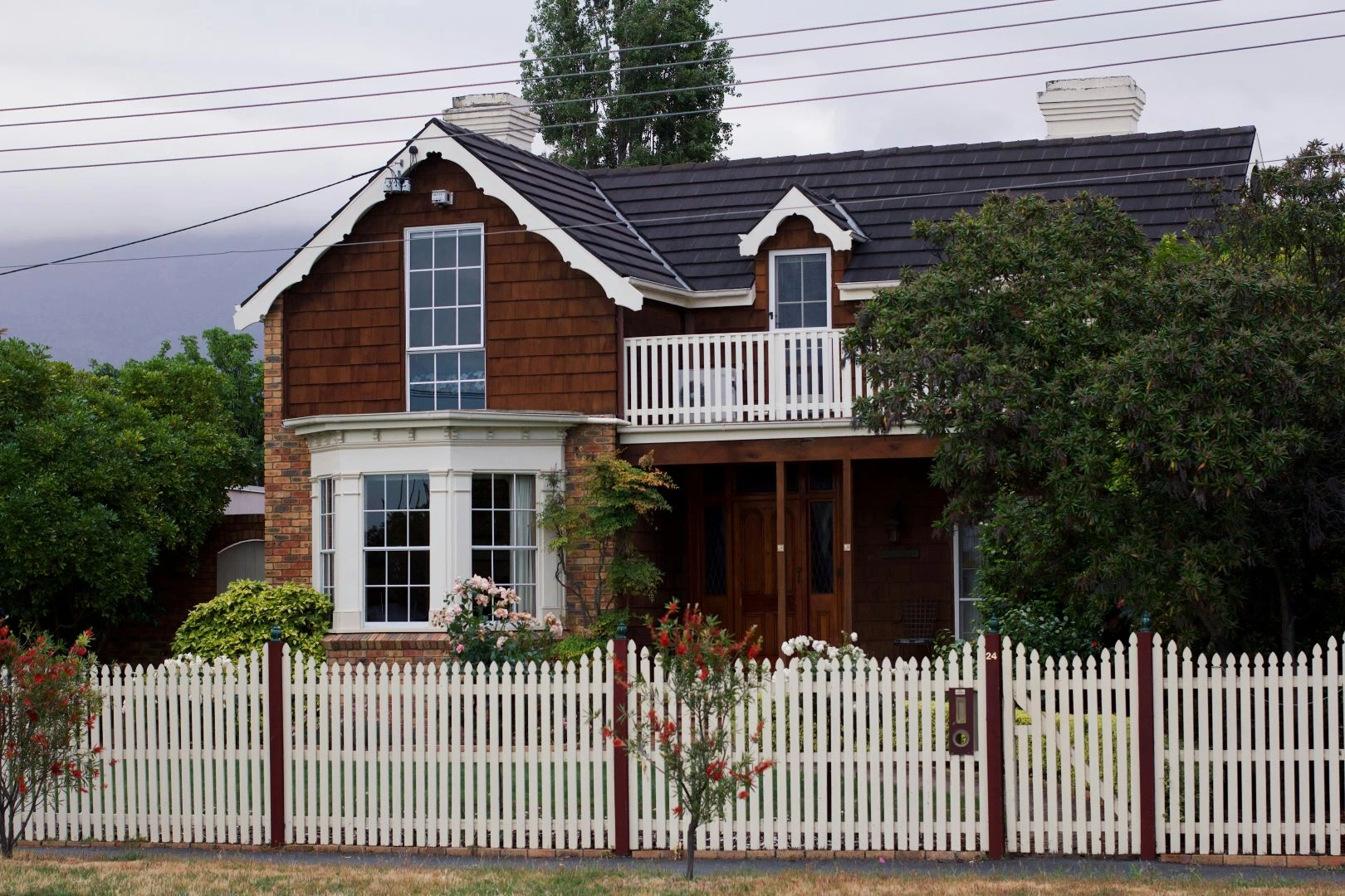
The role of colour and finishes in passive house interiors

When people think about a passive house design, they often picture insulation, airtight construction and high-performance windows. These are the technical foundations of the standard. However, the interior environment is just as important.
Colour, materials and finishes all influence how a home feels to live in. They affect light levels, comfort and the overall atmosphere of a space. When designing a passive house, these choices also support the performance goals of the building.
A well-considered interior helps translate the technical principles of passive building design into everyday comfort.
Light and colour in a passive home
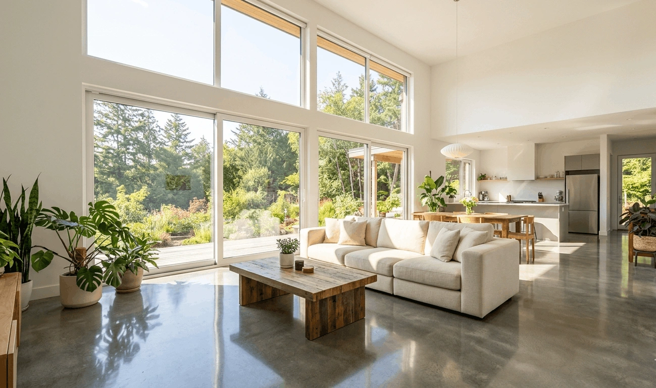
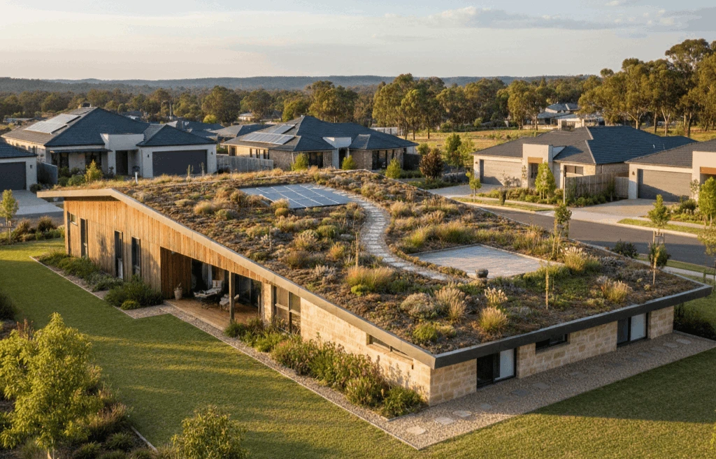
Natural light is a defining feature of most passive house designs. Orientation, window placement and glazing are carefully planned to capture sunlight through the day.
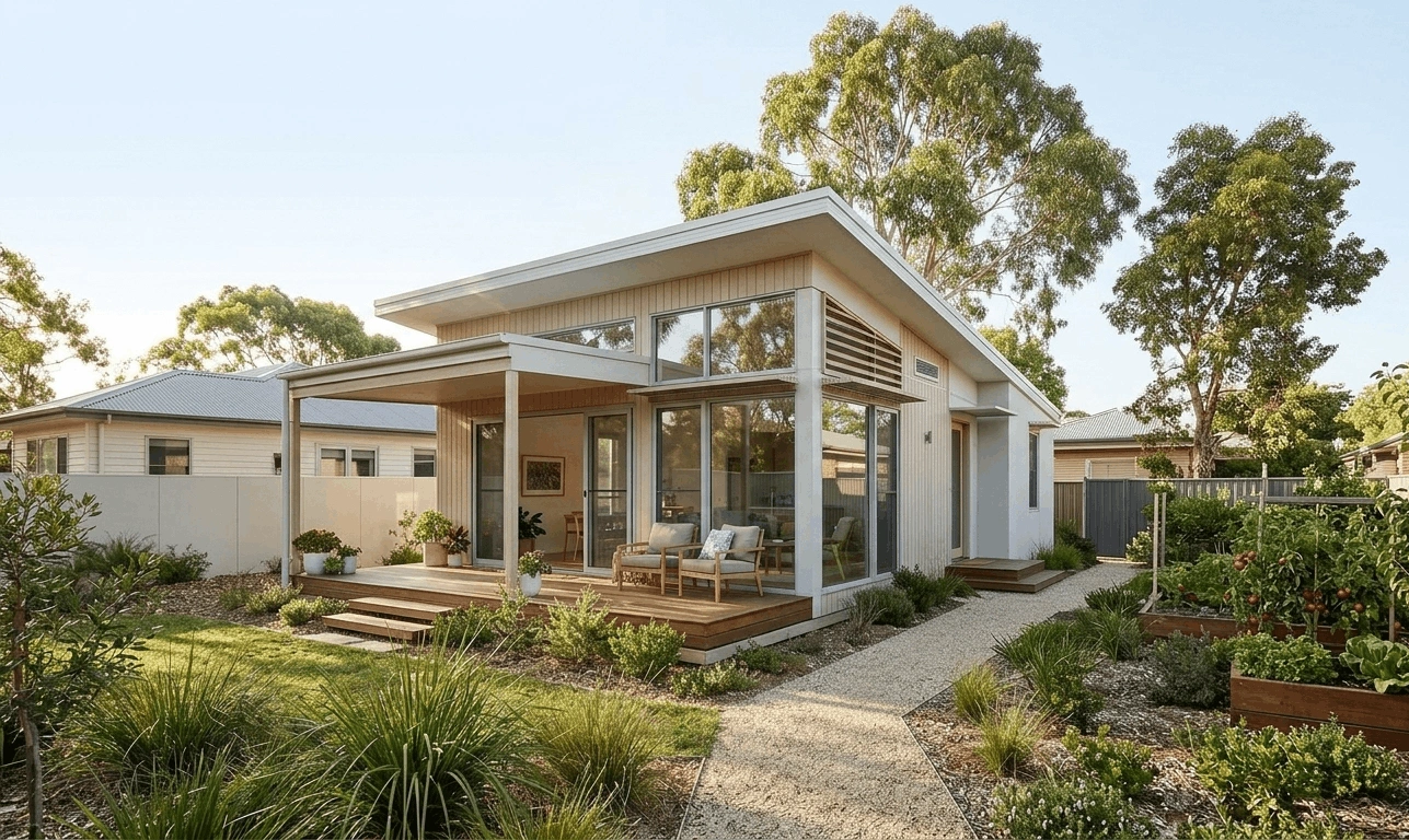
Colour choices can support this effect. Light, reflective colours help distribute daylight deeper into a room. Walls painted in soft whites, warm neutrals or pale earth tones bounce light around the interior. This reduces the need for artificial lighting during the day and helps maintain a calm atmosphere.
In many passive house designs in Australia, the goal is to create a balanced interior that feels comfortable across the seasons.
For example:
- Warm neutral colours work well in living areas where sunlight changes through the day
- Soft greens and muted blues support a relaxed bedroom environment
- Slightly darker tones can define spaces such as studies or reading corners
Colour and thermal comfort
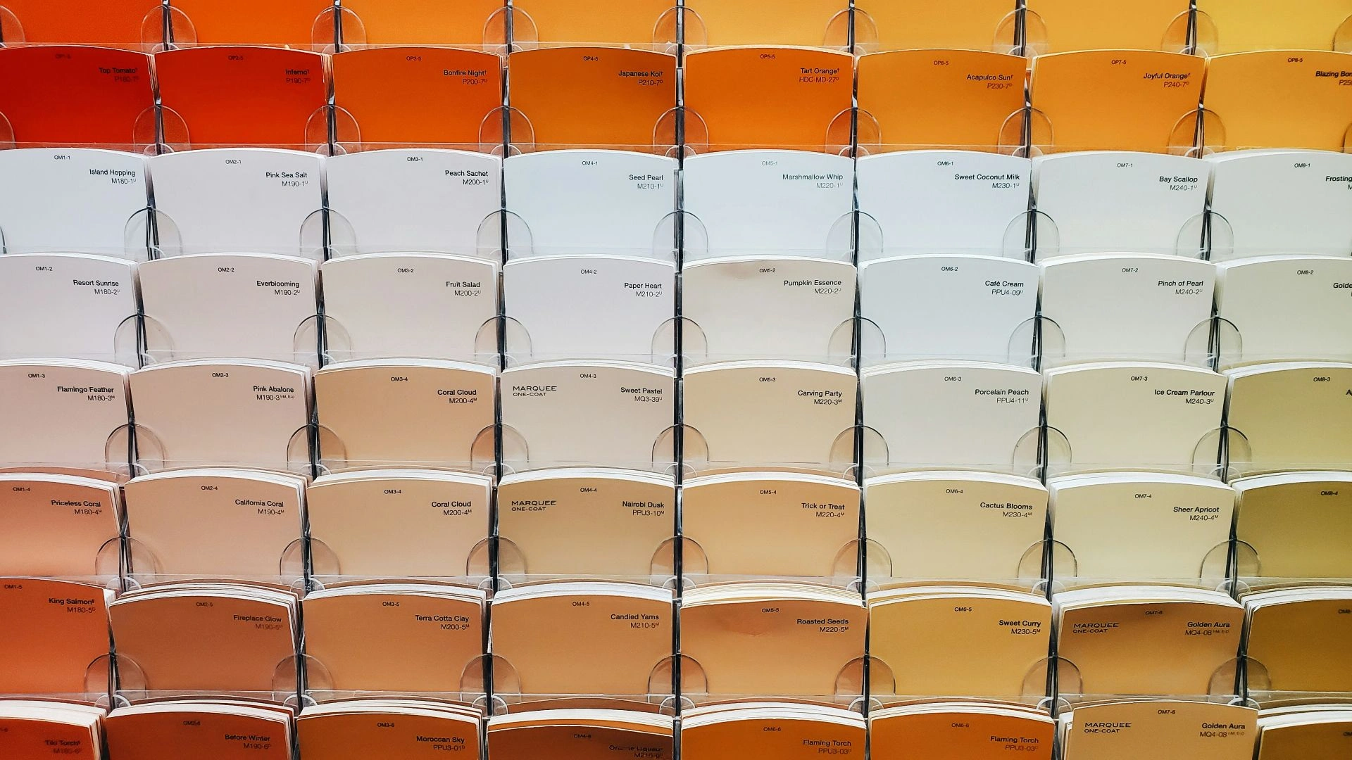
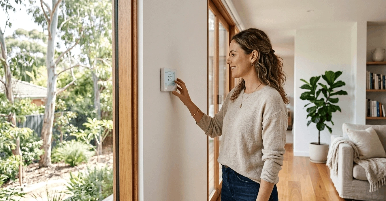
Colour also influences perceived temperature. Warm tones – terracotta, amber, warm white, ochre – can make a space feel cosier even when the thermostat reads identically to a room painted in cool grey or stark white. This psychological warmth is not a small thing. It affects how comfortable people feel, how much they fiddle with the heating controls and how satisfied they are with the home overall.
For passive house projects, where the goal is to reduce reliance on active heating and cooling, encouraging occupants to feel comfortable at slightly lower or higher temperatures is genuinely useful. A well-chosen interior palette can reduce the temptation to override the system, which keeps the building running as it was designed to.
That said, colour selection in passive house designs in Australia should also respond to orientation and climate. A north-facing living room that receives abundant winter sun in a temperate zone might suit a cooler, fresher palette to balance the solar gain. A south-facing bedroom that sees little direct light might benefit from warmer, richer tones to compensate.
Materials that support comfort
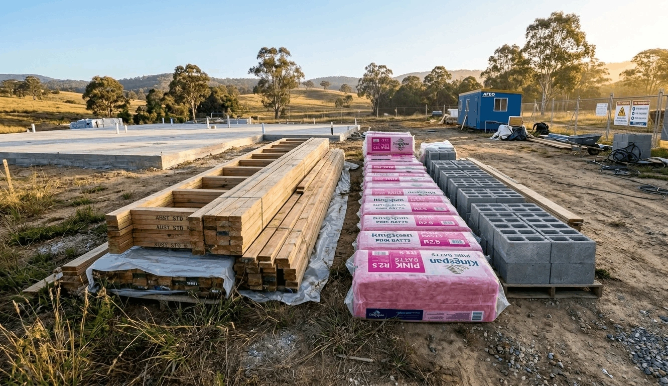
Finishes in a passive design house often prioritise natural materials. Timber, stone, lime plaster and paints with low volatile organic compound (VOC) levels) are common choices. These materials contribute to indoor air quality and help create a calm, grounded atmosphere.
Timber floors, wall panelling or joinery introduce warmth and texture. Timber often becomes a visual anchor for the interior as it softens the precise detailing that is typical in high-performance construction.
Plaster and mineral-based wall finishes are also popular in passive house designs in Australia. These materials diffuse light in a soft way, which reduces glare and supports a comfortable visual environment.
Stone, ceramic and concrete finishes may appear in kitchens or bathrooms. They provide durability while adding contrast to lighter wall colours and timber surfaces.
Texture matters as much as colour
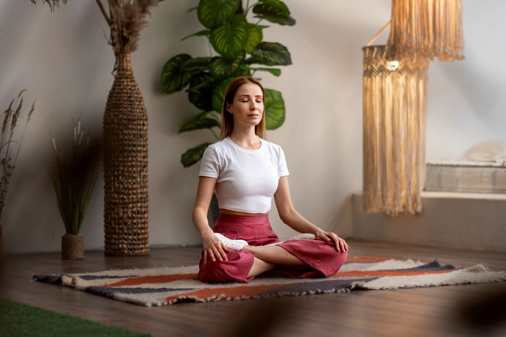
Colour is only one part of the interior palette. Texture plays an equally important role. Smooth painted walls, matte cabinetry finishes and natural fabrics create a layered look without visual clutter. This suits the calm atmosphere that many homeowners want when undertaking passive home building.
Texture also affects how light behaves in a room. Matte surfaces soften reflections and help maintain even lighting. Slightly textured plaster walls create subtle shadows as daylight moves through the space. Timber grain adds depth and warmth.
Consistency across the home
A clear interior palette helps unify the spaces within a passive home. Your passive house designers in Australia may recommend limiting the number of colours and finishes used throughout the home. This approach makes the interior feel calm and cohesive.
For example, a simple palette might include:
- Light neutral walls
- Natural timber flooring
- Soft matte cabinetry
- Stone or composite benchtops
Using the same materials in different rooms builds visual continuity. This approach works particularly well in open-plan layouts, which are common in passive house designs.
Consistency also simplifies construction. When working with experienced passive house builders in Australia, a defined material palette can help streamline ordering, installation and detailing.
Finishes that age well
A passive home is designed for longevity. High-performance construction is intended to last for decades with minimal energy use. Interior finishes should support that long-term mindset.
Timber floors that can be refinished, durable cabinetry finishes and natural materials that age gracefully are all sensible choices. These materials develop character over time rather than looking worn.
This long-term thinking is a key part of passive home building and reflects the values behind passive building design.